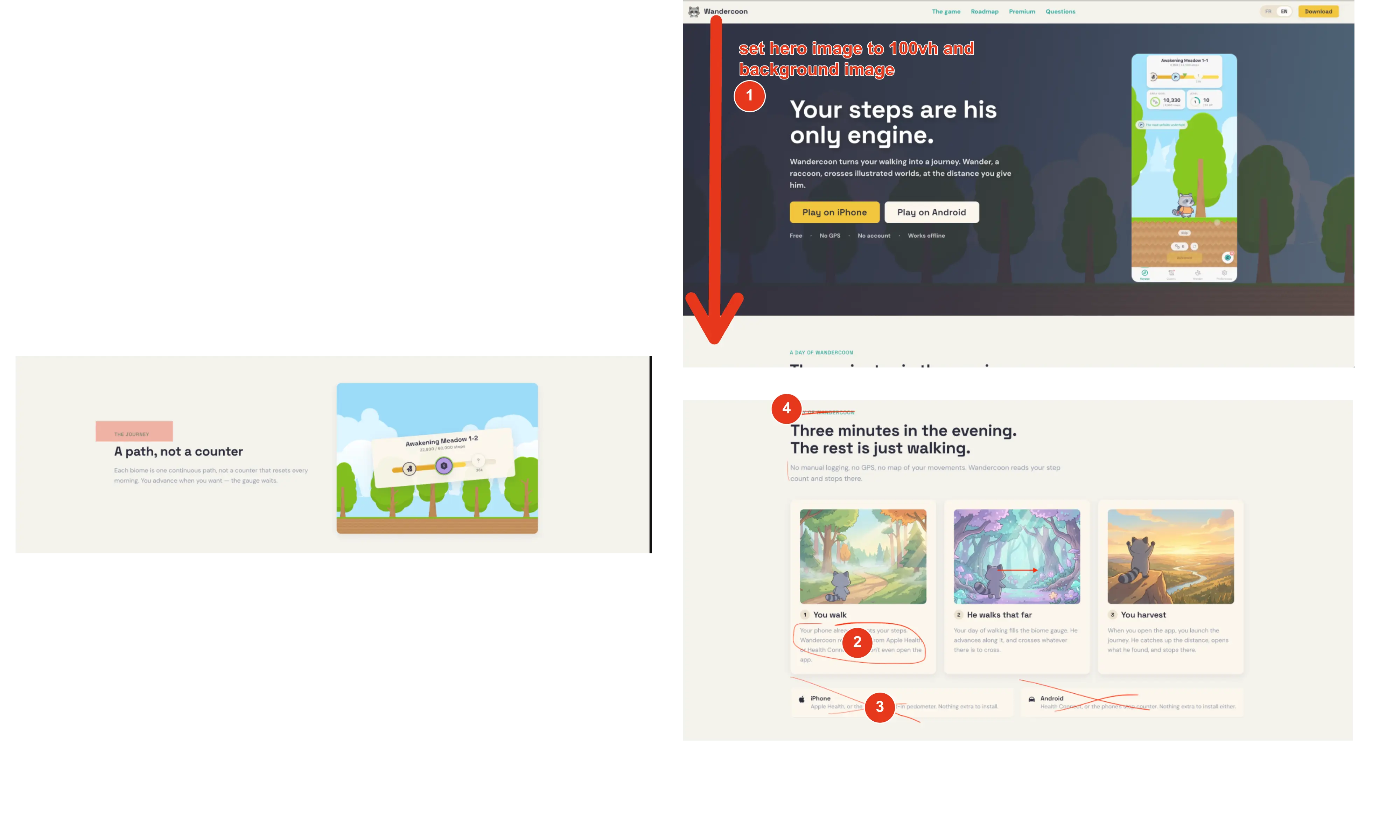
On the desktop version, I’d set the hero section height to 100lvh. I feel like it would make the first impression much more immersive.
I think the overall landing page design is cool, especially the hero section. But in my opinion, there’s a bit too much text to read.
I’d remove the small text right above each title. It adds unnecessary visual information, feels ai and doesnt bring much value 😜
You’re also unnecessarily repeating “iPhone” and “Android” below. I’d remove those. They are already present in the main cta.
L'exécution globale de l'appli c'est propre et fluide pas de bugs, ça fonctionne bien et les textes sont bien lisibles. 👍🏼
--- "Une idée nouvelle chaque jour : l'habitude que partagent la plupart des esprits que l'on admire"
Je pense que c'est un des endroits dans le onboarding qui freine le plus.
C'est pas la forme visuelle, mais la phrase se met a la place de tout le monde avec cette affirmation. qui sont « les esprits que l'on admire » et comment est-ce qu'on sait qu'ils partagent cette habitude ?? ça gagnerais à être plutôt remplacée par peut être quelquechose de plus scientifique ? Sur la plasticité, la transformation de ses habitudes ?
---- « Ce que Highbrow change pour vous »
Je pense qu'il faut s'adresser un peu plus directement aux émotions de tes prospects :
Les bénéfices actuels sont assez abstraits :
« Des idées qui nourrissent vos conversations »
« Un vocabulaire plus riche, sans effort »
« Un regard plus curieux sur le monde »
Je pense qu'il y a effectivement des motivations sociales derrière l'utlilisations de ton app
Avoir quelque chose d'intéressant à dire, mieux s'exprimer, être intéressant dans une conversation, se sentir cultivé, et plus sûr de soi, pouvoir occuper l'attention dans une conversation.
voilà deux exemple s
- Inspirez les autres par vos conversations
- Trouver les mots justes et qui percutent
Je trouve « Un regard plus curieux sur le monde » faible. Peu de personnes ouvrent une app en se disant qu'elles veulent devenir plus curieuses.
Sur l'écran :
« Ajoutez un widget à votre écran d'accueil »
Le sous-titre est :
« Elle vous y attendra chaque matin, sans ouvrir l'app. »
« Elle » fait référence à la citation, mais comme la citation n'a pas été mentionnée juste avant, il faut une petite seconde pour comprendre.
Peut-etre remplacer par :
« Votre citation du jour, directement sur votre écran d'accueil. »
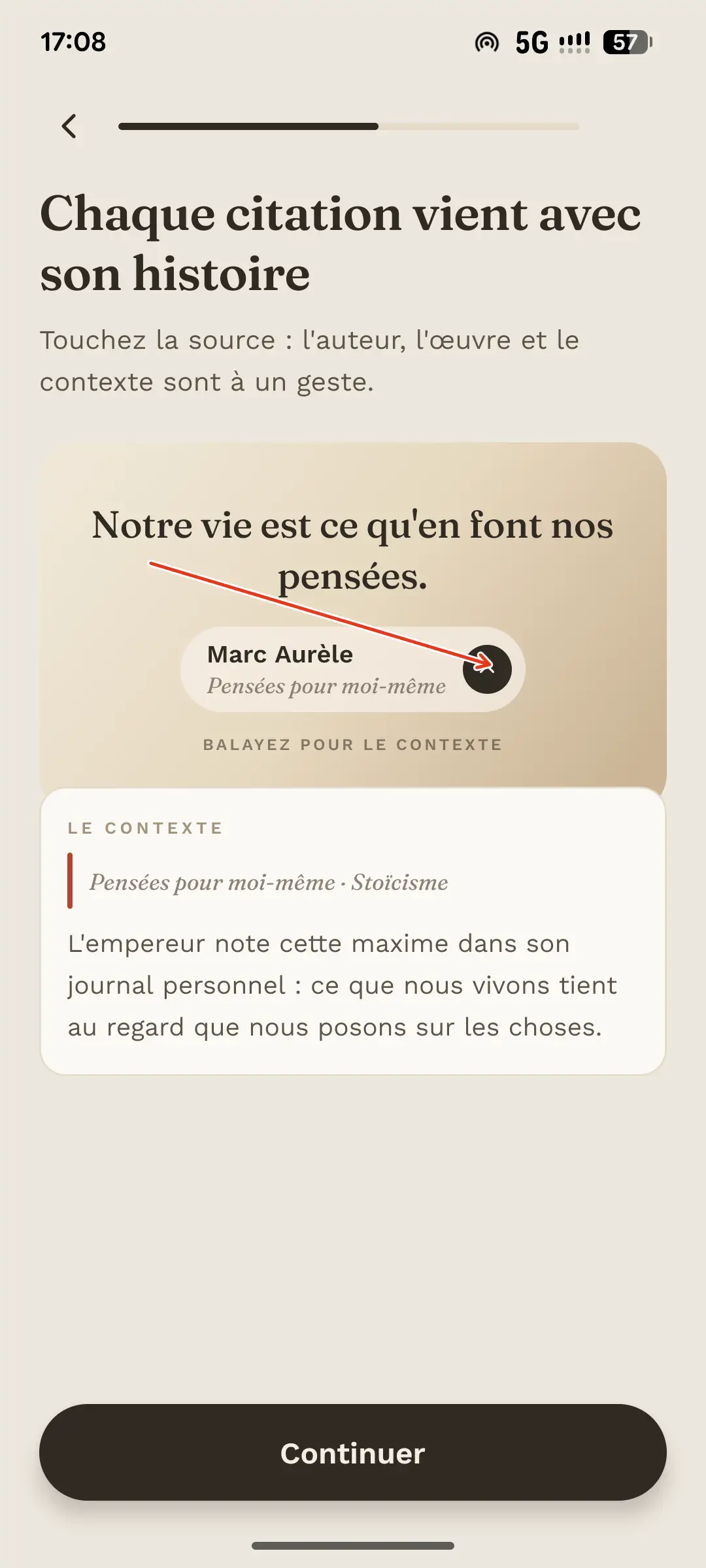
Sur l'écran de onboarding "Chaque citation viens avec son histoire"
Je pense que ça gagnerait vraiment à être dynamique et à montrer un vrai exemple animé/interactif d'une citation. Dans l'App ça rends mieux qu'ici
Actuellement on lit « Balayez pour le contexte », mais le contexte est déjà affiché. Du coup l'écran explique l'interaction plutôt que de vraiment la faire vivre.
ex : La citation apparaît → l'utilisateur clique/balaie → la carte se déploie (comme dans l'app)→ l'auteur, l'œuvre et le contexte apparaissent. et le bouton continuer s'affiche uniquement après.
Pour finir : l'identité visuelle communique déjà bien le côté culture, livre, connaissance . Il n'y a pas vraiment besoin de le réexpliquer.
Je vois juste peut-être un peu de finitions à faire au niveaux de copywriting qui pourrait potentiellement améliorer les conversions.
Clean page with a distinctive style. It feels polished and well organized overall. 👍
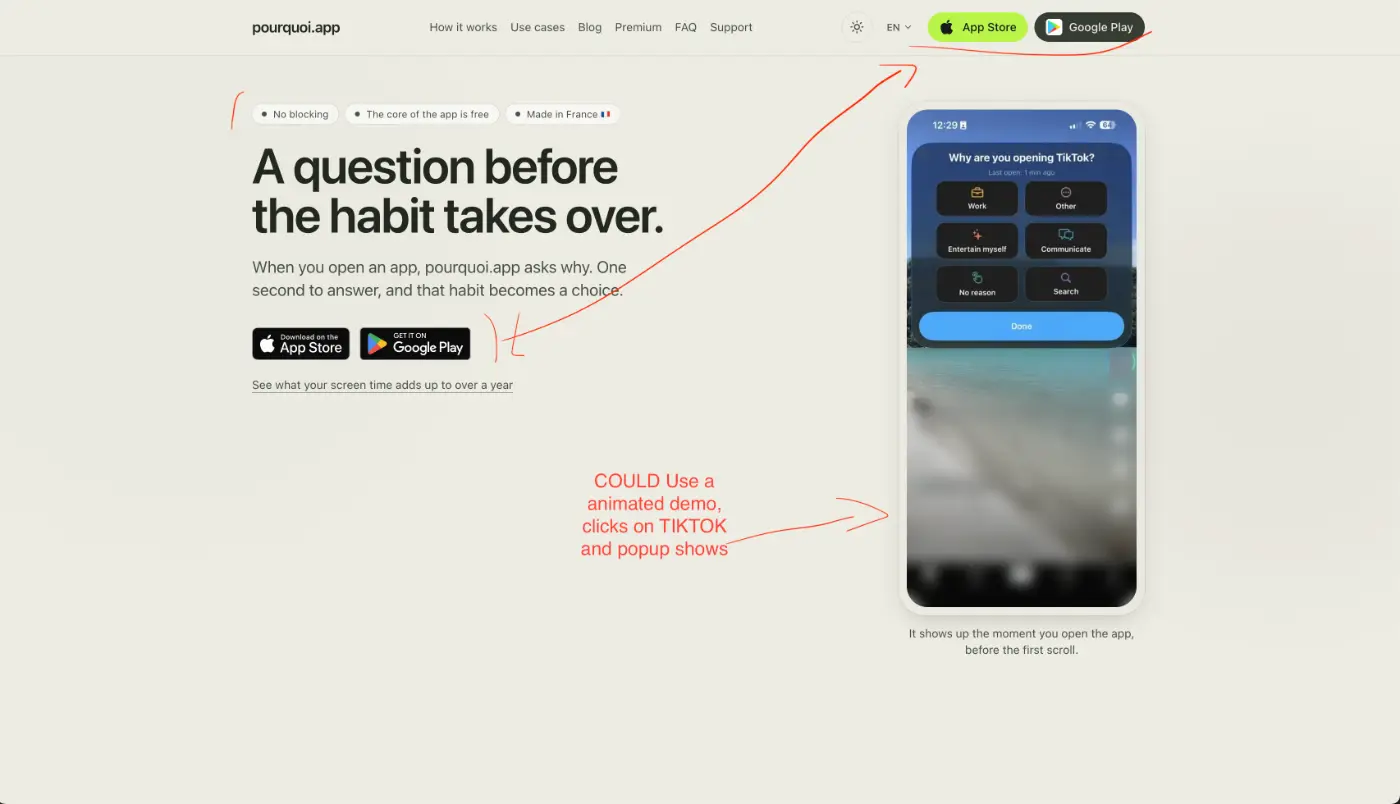
The French hero headline feels weaker than the English one.
“Une question avant le reflexe.” doesn’t communicate the idea as immediately as “A question before the habit takes over.”
I also think the hero title could be more about what the user needs are and not just a description of the product, The value proposition of the product still feels slightly abstracts to me.
“When you open an app, pourquoi.app asks why” explains the mechanism, but not quite the outcome. I understand what happens, but I have to infer why I want it. Something like “Break mindless scrolling" ? Perhaps removing the 3 badges. and replacing it with it ? (The 3 badges add unecessary information in my opinion at this stage where user are just discovering the product) First of all only show the Made in France badge and flag to French viewers, it’s unlikely to add much value for international users.
The "no blocking" badge is very abstract, and even more in French.
The hero could also demonstrate the product instead of just showing it.
A short looping animated demo (WebP atlas or similar) could work really well. either a dynamic one or looping animation.
The navigation top bar dowload buttons with the appstore and google play link adds visual information that compete with the other hero CTA. (The reason it competes visually is the added visual details, color , the playstore icon white background on the green buttons...)
I think there is also Too much space under the hero text section, perhaps inviting in a small piece of the next section in order to invite users to scroll in? Perhaps centering vertically the hero text section could help.
To finish with this : I think the main issue is that the value proposition is not obvious enough for users in theirs first 3 seconds of them visiting the page.
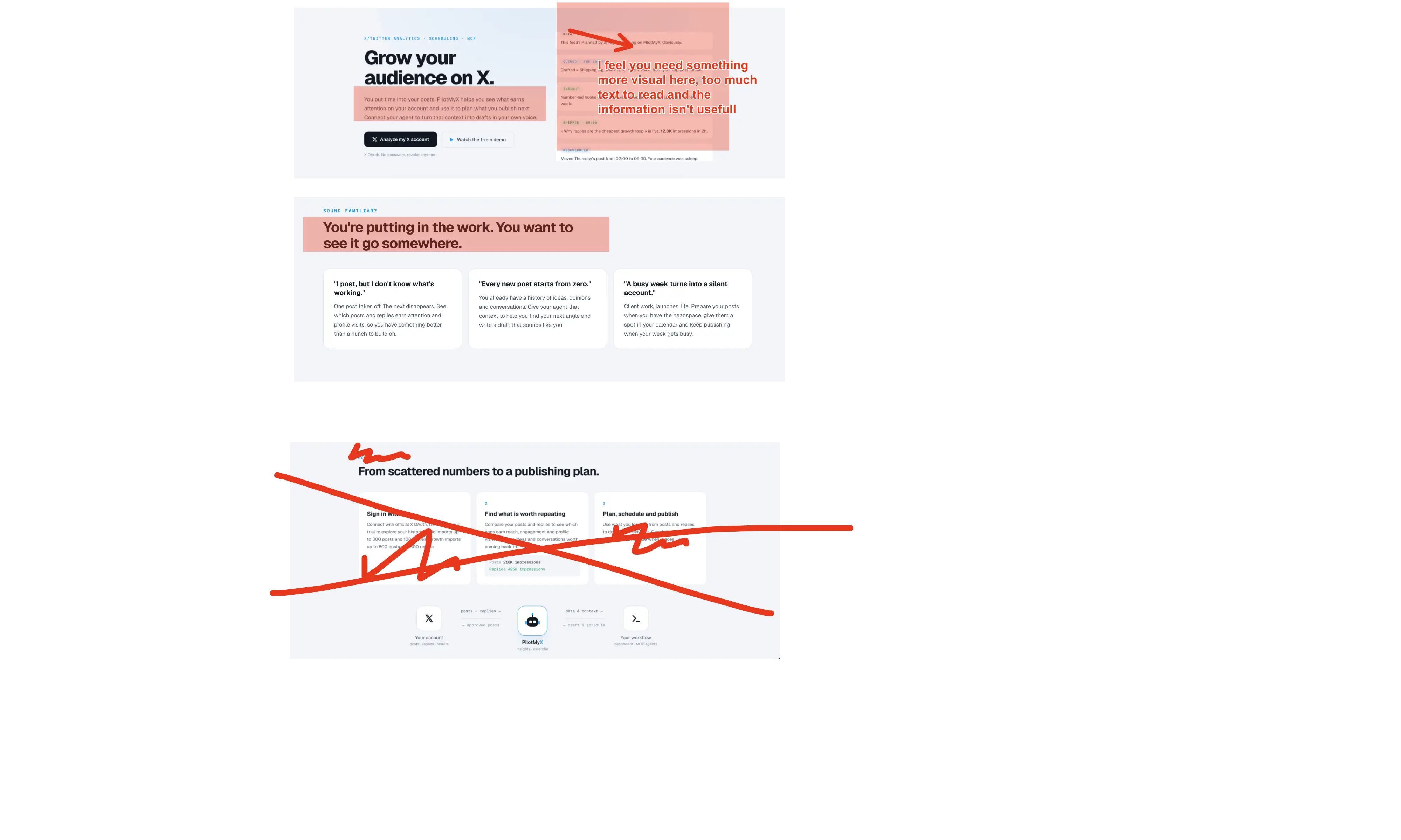
Way too much text and visual information in almost every section. The copy also feels heavily AI-generated: lots of words, but very little that clearly communicates why I should care.
Desktop feels slightly better simply because there’s more breathing room, but the problem is the same.
The hero animation on the right isn’t really helping either. It takes time to understand, yet still doesn’t clearly show how the tool is useful or what outcome I get from using it.
“Make your next post a step forward.”
Weak, generic CTA.
When I read a landing page, especially for a small product, I want to feel like a human wrote it. Right now, I have to work way too hard to understand the actual value of your tool.
And for the demo: **PUT YOUR FACE ON IT. USE YOUR VOICE.**
The current video demo is honestly doing more harm than good. It feels impersonal and doesn't give me a reason to trust or care about the product.
Just because you can make a slick animation with Claude doesn't mean you should. A simple screen recording with you explaining what the product does, why you built it, and showing one concrete use case would probably be much stronger.
I’m sure this kind of tool can work. The product itself isn't the issue (tho I havn't tried it) But you can really improve the landing page.
The landing page currently contradicts itself about ads. One section rules out ads that double rewards; another describes rewarded videos that double the moon's payout. Fix that before launch and explain exactly what Zarden World removes. People should understand which rewards come from sleep, which come from watching ads and which require payment.
The harvest is the moment you're selling, yet its video area contains a visible production placeholder. Replace it with actual gameplay. I want to see a night imported, crops changing and the morning harvest, including a poor night and missing sleep data. The pixel artwork shows the setting; it doesn't prove the loop feels satisfying.
The page says the app is coming to iPhone, while the privacy section also mentions Health Connect. Make current availability and the Android plan consistent. There's no clear release window or product-specific signup by the main call to action. Send interested visitors to one place where they can follow the release. Asking them to find updates on X loses people who were ready to try the app.
Rewarding better sleep with faster growth deserves careful testing. A person struggling to sleep may have little control over the result. Lower rewards can make that person feel worse without helping them rest. You say progress never reverses; show what a rough week actually earns and consider rewarding a routine the player can control. Avoid promising better sleep without evidence.
Manual entry solves missing Health samples but also lets people manufacture their main resource. Decide how much that matters. If the fun depends on earning scarce rewards, unlimited self-reporting can flatten the progression. If honesty is enough, keep the design consistent with that and explain the fallback clearly.
One free island, three crop types and sessions of one to three minutes may run out of variety quickly. Show what becomes interesting after week two and test returns after the first harvest novelty fades. Don't assume another island will fix a repetitive loop.
Optional ads plus paid content also need an economic check. Estimate income per returning player against the cost of art, new islands and support. The public page can't answer that yet. I'd finish the demo, settle the reward model and validate repeat use before expanding the world.