
Now roasting
Health, Fitness & Wellness

pourquoi.app

Use your phone on purpose. No app blocking, no guilt.

2 roasts🔥 0 heatShare on X ↗
pourquoi.app website preview

Roast pourquoi.app

0 / 3,000

Roast the product, not the person. Sign in is required when posting.

The roasts

2 roasts

Clean page with a distinctive style. It feels polished and well organized overall. 👍 The French hero headline feels weaker than the English one. “Une question avant le reflexe.” doesn’t communicate the idea as immediately as “A question before the habit takes over.” I also think the hero title could be more about what the user needs are and not just a description of the product, The value proposition of the product still feels slightly abstracts to me. “When you open an app, pourquoi.app asks why” explains the mechanism, but not quite the outcome. I understand what happens, but I have to infer why I want it. Something like “Break mindless scrolling" ? Perhaps removing the 3 badges. and replacing it with it ? (The 3 badges add unecessary information in my opinion at this stage where user are just discovering the product) First of all only show the Made in France badge and flag to French viewers, it’s unlikely to add much value for international users. The "no blocking" badge is very abstract, and even more in French. The hero could also demonstrate the product instead of just showing it. A short looping animated demo (WebP atlas or similar) could work really well. either a dynamic one or looping animation. The navigation top bar dowload buttons with the appstore and google play link adds visual information that compete with the other hero CTA. (The reason it competes visually is the added visual details, color , the playstore icon white background on the green buttons...) I think there is also Too much space under the hero text section, perhaps inviting in a small piece of the next section in order to invite users to scroll in? Perhaps centering vertically the hero text section could help. To finish with this : I think the main issue is that the value proposition is not obvious enough for users in theirs first 3 seconds of them visiting the page.
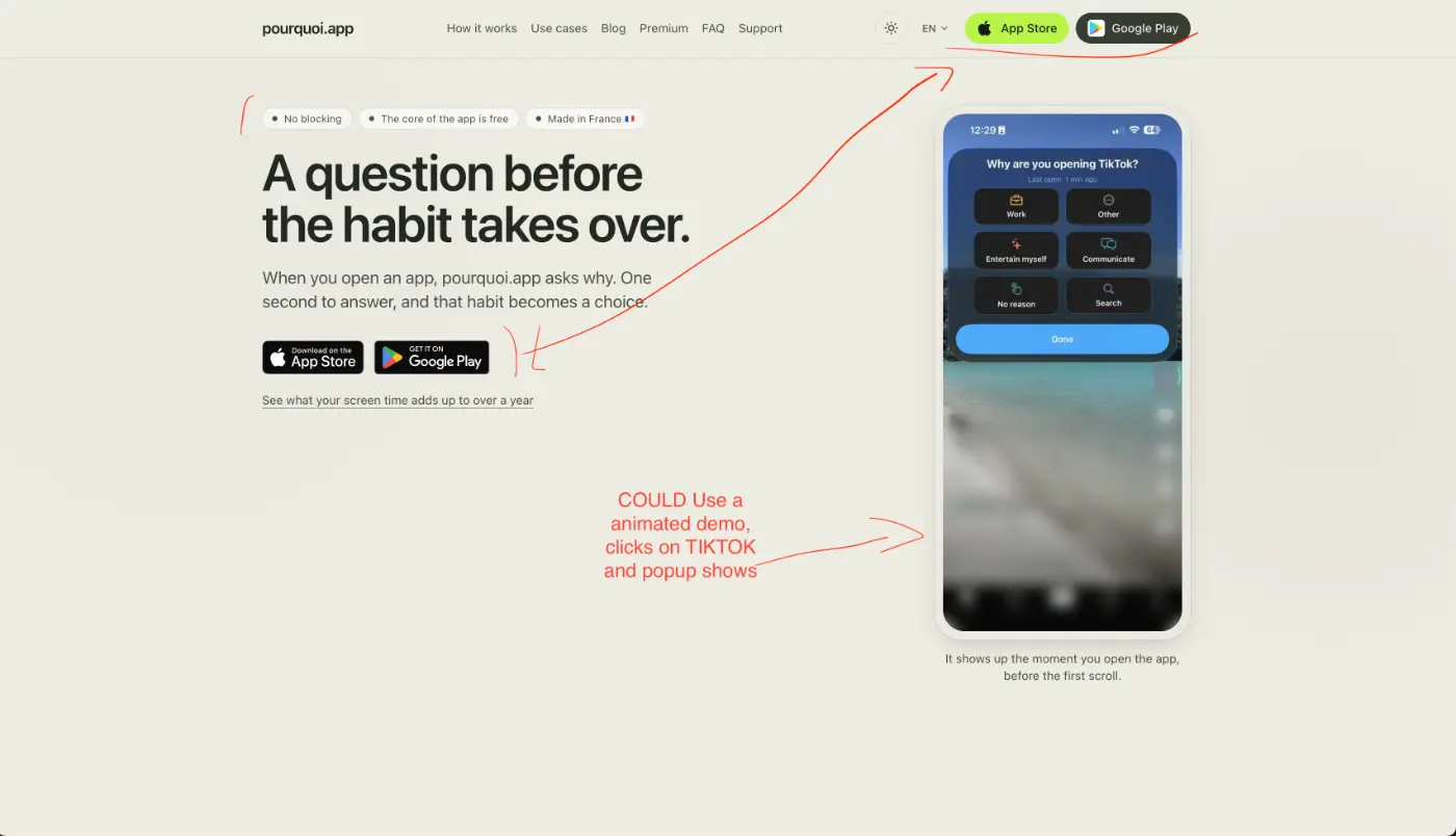
Screenshot attached to this roast
Annotated screenshot · 31 KB
Screenshot attached to this roast
Share
•••

Report this roast

Reports are private. Choose the clearest reason.

  1. What a roast... Full of value thank you! A lot of good ideas that I'll surely apply.. THANK YOU!

Top roast

I agree with Gabriel on the value prop. My angle is a bit different: the site and the app try hard to be right, but not really to make me want to buy. WEBSITE - A lot of text. Blog, glossary, use cases, "intention approach"… Good for SEO maybe, but the home page feels more like a wellness article than a page that pushes me to download. No social proof, no numbers, no before/after. - The FAQ "Does it really work?" basically says "we don't promise anything". It's honest, but it's THE question that decides if I pay, and the answer is a polite no. - Everything is explained with "no": no blocker, no gamification, no guilt. I know what the app is not, but I don't really know what I get. - Pricing section is not very sexy. Prices are shown twice (cards + table). "Same experience, at your pace" doesn't sell anything. Yearly plan is ~€2.50/month, so -50% vs monthly, and you don't even show it! The "7-day trial" line doesn't belong in the features table. And the "7 days free" button only goes to the App Store, so Android users are forgotten. APP (iOS) - The "OK" button kills it for me. After a few days I tap it without thinking, which is exactly the reflex the app wants to break. - Sometimes there's a delay when I open an app, it's annoying. The app that should help me slow down makes me wait, but not in a useful way. - Personally I would prefer a clean block, no skip possible, and faster than Shortcuts. I know iOS limits a lot here, and I know it goes against the "no blocker" idea, but asking an answer before opening is not blocking, it's keeping the promise. OVERALL It's all too "nice": soft, calm, respectful… and because of that I don't feel like paying. It needs more punch: show the real cost of scrolling (your screen time calculator is a great weapon, put it in the hero!), a concrete result, a reason to upgrade now. Great product intention. It just needs more sales intention 😉

Share
•••

Report this roast

Reports are private. Choose the clearest reason.