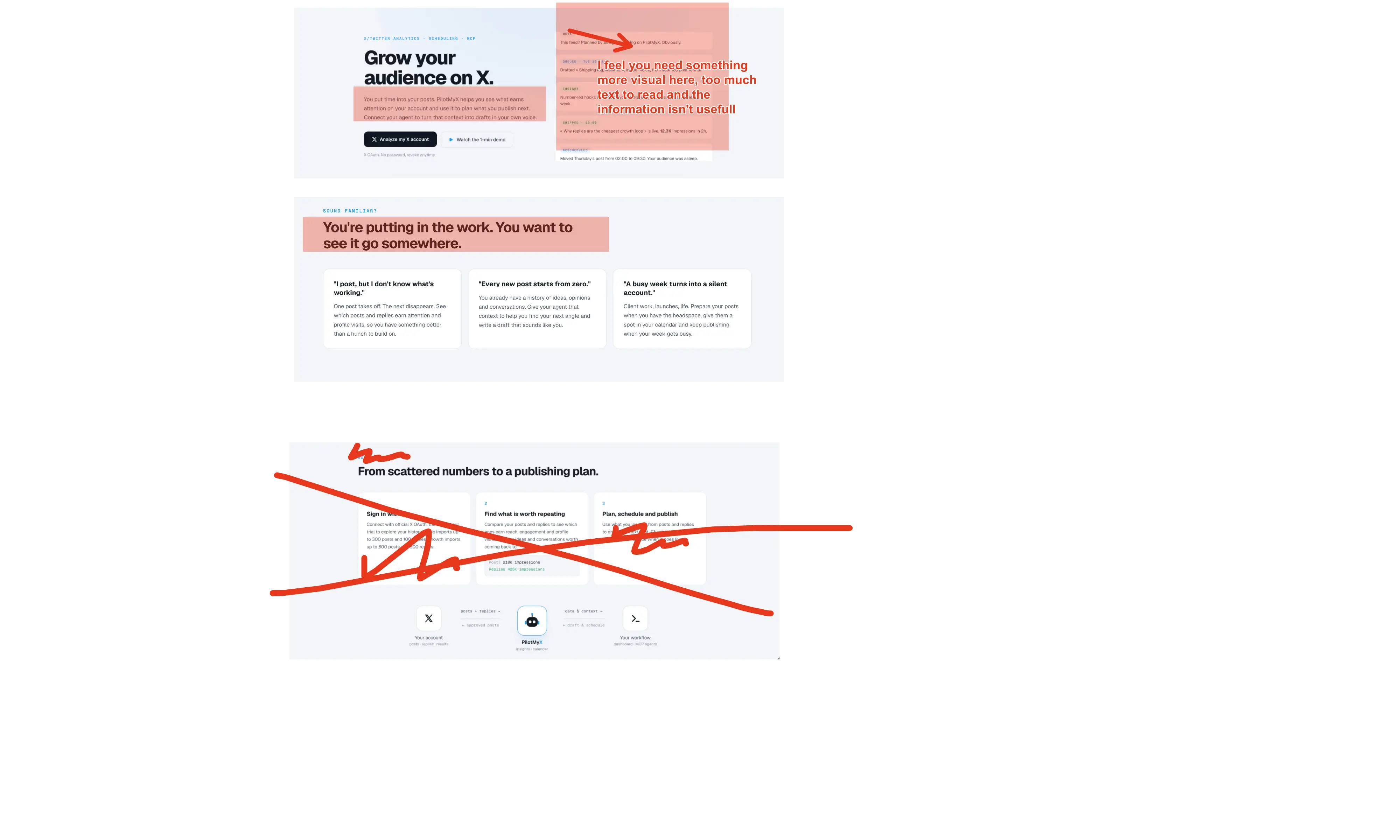

Way too much text and visual information in almost every section. The copy also feels heavily AI-generated: lots of words, but very little that clearly communicates why I should care. Desktop feels slightly better simply because there’s more breathing room, but the problem is the same. The hero animation on the right isn’t really helping either. It takes time to understand, yet still doesn’t clearly show how the tool is useful or what outcome I get from using it. “Make your next post a step forward.” Weak, generic CTA. When I read a landing page, especially for a small product, I want to feel like a human wrote it. Right now, I have to work way too hard to understand the actual value of your tool. And for the demo: **PUT YOUR FACE ON IT. USE YOUR VOICE.** The current video demo is honestly doing more harm than good. It feels impersonal and doesn't give me a reason to trust or care about the product. Just because you can make a slick animation with Claude doesn't mean you should. A simple screen recording with you explaining what the product does, why you built it, and showing one concrete use case would probably be much stronger. I’m sure this kind of tool can work. The product itself isn't the issue (tho I havn't tried it) But you can really improve the landing page.