

I'm genuinely addicted to Wandercoon. I love the vibe, and it actually makes me want to walk more just to hit my goals and complete quests. A few things frustrate me, though. The biggest one is when I forget to validate my steps. I've missed quests because of it, and it feels really frustrating when I've actually done the walking. The collectible system is fun, but I hope it goes much further. It feels like there's a lot of potential there to make progression even more rewarding. The app doesn't take long to understand overall, but I think the UI/UX could be clearer. Some information and features are harder to find than they should be. Overall, I really love the app. The core concept already works on me, and I hope you'll keep building on it and find the features that can turn Wandercoon into something incredible.
Wandercoon
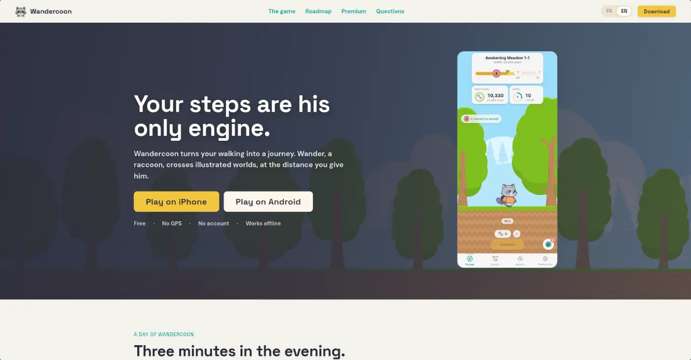
Wandercoon turns your walking into a journey. Wander, a raccoon, crosses illustrated worlds, at the distance you give him.
Roast Wandercoon
The roasts
3 roastsNico Carrion’s roast of Wandercoon

Checked the site on desktop + mobile (with Lighthouse) and played the Android app v1.1.2 on an emulator, from onboarding to the shop. But I use it on my real phone too so the step loop is OK LANDING Honestly a nice one. The copy is great, "Your steps are his only engine" says it all, and "He hasn't moved since earlier" made me smile. The live mockup in the hero is cool, and No GPS / No account / Offline right under the buttons is the right call. Tech is clean too: 100 perf on desktop, SEO 100. Small things: - "11 cloud walkers" in a big card kinda backfires. 376k steps looks great, I'd hide the user count for now. - No price on the page, but the app shows clear ones (€19.99/yr). You're all about transparency, just show them. - Your best answers are hidden in the FAQ accordion ("stop for a week? Nothing happens. No broken streak"). That's a selling point, bring it up. - Grey text on cream is a bit hard to read, and on mobile the 400 KB logo (shown at 30px) drops perf to 86. The header button also overflows at 360px. APP Stuff I liked: - Short, warm onboarding, and the color I picked shows up in the game right away. - Health Connect only asks for Steps, and you show a postcard preview before the notif prompt. Super clean. - The album with silhouettes + little hints is my favorite part, it makes me want to walk. - The first tap-to-catch collectible is cute. Stuff that bugged me: - Screen 3 on Android says "iPhone pedometer or Apple Health" 🙃 - The paywall popped up on its own ~3 min in, before a single step. I'd wait until the end of day one. - "Retroactive step catch-up" is a premium perk, but the site says you don't even need to open the app and you don't move faster by paying. It's probably a naming problem you should take care of it, it could be misunderstood - The trial is only on monthly, and the annual plan doesn't show it's -67%. - "Your steps stay on your device" vs a global step counter + "See other travelers". Probably anonymous stats, just say so. - Shop: 36 apples, cheapest item 270, and countdown timers everywhere. Timers feel off in a "nothing urgent" game, and a cheap first item would give me a win on day one. - "Complete 100 quests, 6 days left" on my first day, I'm already behind 😬 - Level card: big "5" next to a small "1". Took me a sec to get that's level 1, 5 XP. - The event art (painterly, grey raccoon) doesn't match the flat game or the brown raccoon I picked. OVERALL Really solid base: cozy mood, honest pitch, clean permissions. Most of my notes are about the promises (chill, no pay-to-win, local data) not quite matching the paywall and the shop yet. Fix that and it's a lovely little app 🦝

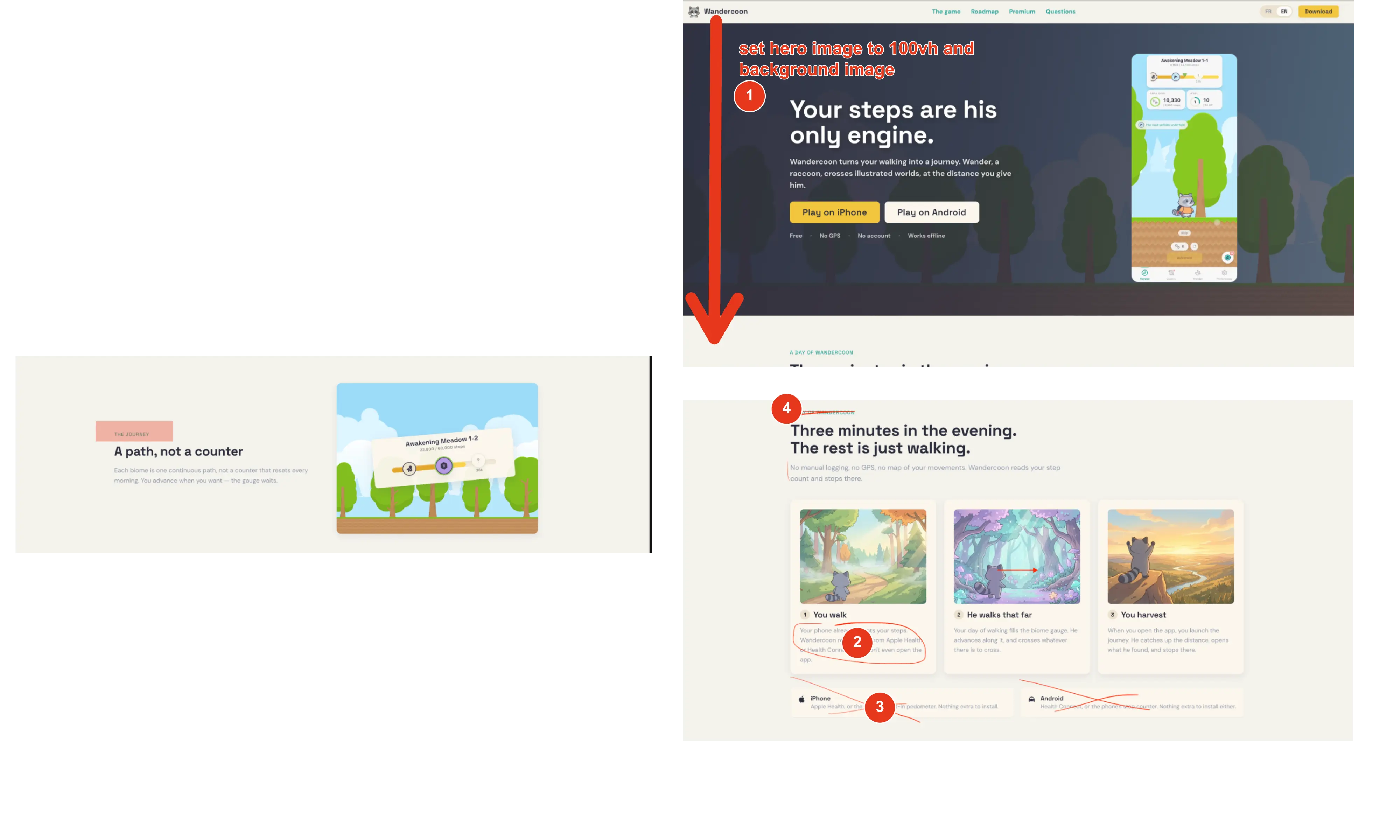
On the desktop version, I’d set the hero section height to 100lvh. I feel like it would make the first impression much more immersive. I think the overall landing page design is cool, especially the hero section. But in my opinion, there’s a bit too much text to read. I’d remove the small text right above each title. It adds unnecessary visual information, feels ai and doesnt bring much value 😜 You’re also unnecessarily repeating “iPhone” and “Android” below. I’d remove those. They are already present in the main cta.
Know when the feedback lands.
Get email updates for new roasts and replies on this product. Confirm your address first; unsubscribe whenever you like.